How to Coordinate Wedding Rentals in Flathead Valley

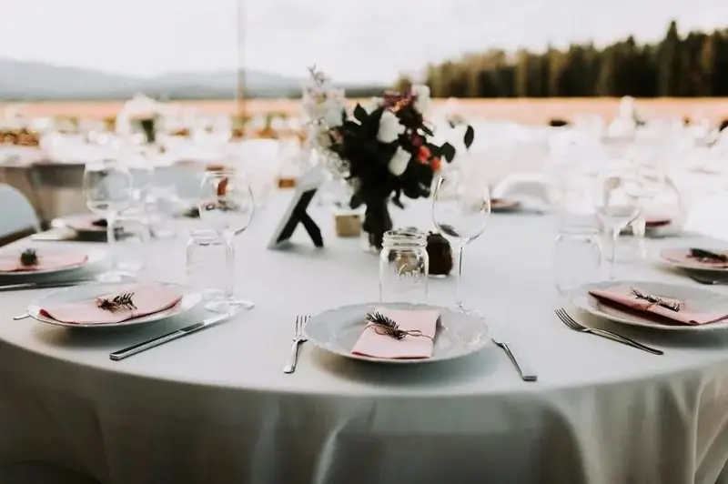
A cohesive wedding design is rarely created by making every rental item match exactly. In fact, when chairs, linens, glassware, florals, and tabletop pieces all repeat the same color too closely, the result can feel flatter and more literal than intended. Stronger wedding design usually comes from coordination: allowing different materials, finishes, and tones to relate to one another without becoming identical.
For a Flathead Valley wedding, that distinction matters even more because the venue itself is already contributing color, texture, and atmosphere. Wood tones, stone, open landscapes, lake views, natural light, and existing architecture all become part of what guests see. Rental selections should respond to those surroundings rather than competing with them or trying to reproduce them too literally.
The most useful way to approach wedding rentals is therefore to think in layers. Furniture establishes the foundation, linens introduce color and texture, and tabletop details refine the design at the level guests experience most closely. When those elements are considered together, the finished reception feels connected without becoming overly coordinated.
Start With a Design Direction, Not a List of Colors
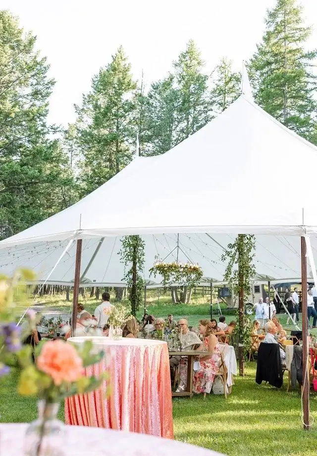
A color palette is useful, but it is not enough to guide an entire wedding design. Two weddings can use nearly identical colors and still feel completely different depending on the materials, furniture, venue, and level of formality surrounding them.
Before selecting individual rentals, couples should define how they want the celebration to feel.
Define the Mood Before the Details
Terms such as romantic, understated, textural, modern, garden-inspired, or landscape-led can be more useful early in the process than choosing an exact shade of green or ivory.
A refined and minimal wedding, for example, may rely on neutral linens, simple glassware, and clean furniture lines. A softer, more romantic celebration might use layered fabric textures, warmer materials, and more detailed tabletop elements. Neither approach depends on one specific color.
This broader design direction gives each later rental decision context.
Choose a Few Anchor Colors
Once the mood is established, a small group of anchor colors can help keep the design focused.
Rather than assigning one exact color to every category, couples can work with primary tones, supporting neutrals, and a limited number of accents. The strength of this approach is that it creates flexibility. The napkin does not need to match the bridesmaid dress, and the glassware does not need to repeat the floral color exactly.
The palette becomes a range rather than a strict formula.
Define Materials Alongside Color
Materials often do as much visual work as color.
Natural wood, clear or colored glass, polished or matte metal, textured linens, ceramic pieces, and upholstered furniture all create different impressions even when their colors are similar.
A wedding that uses mostly neutral tones can still feel layered if the materials vary thoughtfully. Conversely, a colorful palette can feel chaotic if too many finishes are competing at the same time.
Let the Venue Become Part of the Palette
The venue is not a blank background. It is one of the largest design elements in the wedding. Ignoring its colors, textures, and architecture can make even beautiful rentals feel disconnected from the space.
Notice What Is Already Present
Before finalizing furniture or linens, look carefully at the venue itself.
Consider the existing:
- Wood tones
- Stone or masonry
- Flooring
- Walls
- Permanent fixtures
- Outdoor landscape
- Natural light
- Built-in furniture
These elements do not need to be copied, but they should be acknowledged. A darker interior may support different linen choices than an open tent or light-filled outdoor setting. A venue with strong wood tones may already provide enough warmth that additional dark finishes become unnecessary.
Work With the Setting Rather Than Covering It Up
Scenic venues in the Flathead Valley often already provide a strong visual identity.
The goal does not need to be translating the surrounding landscape into a literal wedding theme. A mountain setting does not require pine-green everything, and a lakeside reception does not need blue glassware simply because water is nearby.
Instead, couples can allow the environment to contribute naturally while selecting rentals that feel comfortable within it. This creates a more timeless result than designing too literally around location.
Consider How the Venue Changes Throughout the Day
A space can look very different in afternoon light than it does after sunset.
Outdoor reception areas may feel brighter and more neutral during the day, while evening lighting can bring warmer tones forward. Interior materials may also appear deeper as natural light fades.
Rental selections should therefore be evaluated with the full event timeline in mind. A linen color that looks subtle in daylight may feel much stronger under evening lighting, while reflective glassware or flatware may become more noticeable after sunset.
Choose Tables and Seating Before Finalizing Linens
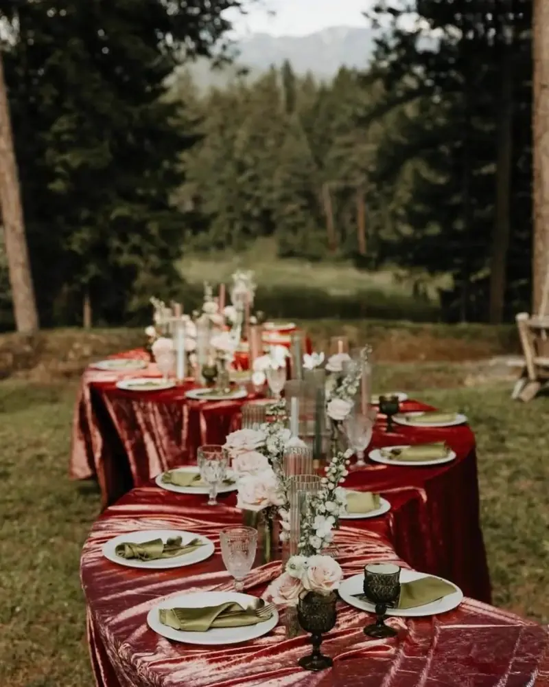
Furniture establishes the largest visual shapes in the room, so it should usually be settled before the finer textile and tabletop choices.
That does not mean every table and chair decision has to be permanent before anything else is discussed. It simply means the major furniture direction should be clear enough to give the rest of the design something to respond to.
Treat Furniture Finishes as Part of the Palette
A natural wood table already contributes warmth. A darker chair adds contrast. A lighter or more neutral seating finish may recede visually and allow florals or linens to take more attention.
These finishes should be considered just as carefully as fabric color.
If the furniture already has strong visual character, quieter linens may allow it to remain part of the design. If the tables are primarily functional bases, textiles may take on a larger role.
Decide Whether the Table Should Be Covered or Visible
Not every table needs to disappear beneath a full linen.
Some tables may be attractive enough to remain partly or fully visible, particularly when the material itself contributes to the design. Others may work better as a neutral base beneath linen.
This decision affects everything that comes afterward. An exposed wood surface creates a different visual relationship with glassware, napkins, and florals than a fully covered table.
Mixed approaches can also work when they are intentional. A wedding might use one treatment for dining and another for cocktail or accent tables without losing cohesion.
Remember That Chairs Repeat Throughout the Room
Chairs are sometimes treated as background elements, but their repetition gives them considerable visual influence.
One chair finish may appear fifty, one hundred, or more times throughout a reception. That means even a subtle style can become one of the dominant visual elements in the room.
The chair does not need to match the table exactly. It simply needs to relate comfortably to the furniture, venue, and overall level of formality.
Use Linens to Establish Color and Texture
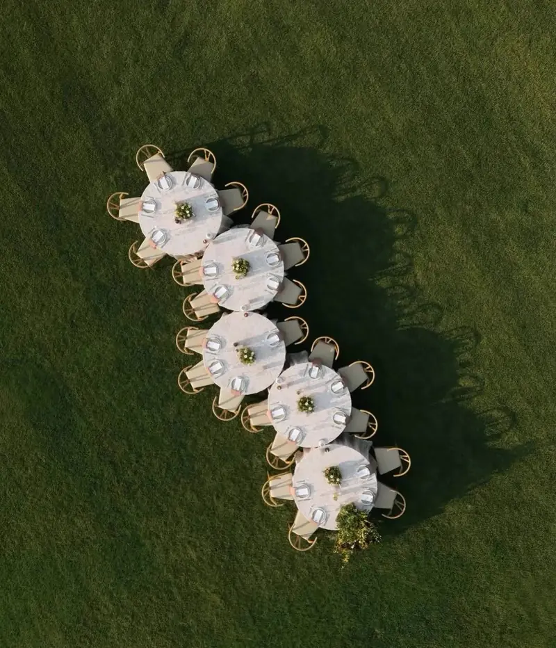
Once the larger furniture choices are understood, linens can begin carrying more of the color story.
Linens are one of Celebrate Event Rentals' major design categories alongside dishware, glassware, and flatware. Their role is not simply to cover tables. They can introduce contrast, softness, depth, and movement within the room.
Begin With the Base Linen
The base linen sets the tone for the entire table.
It may be neutral and quiet, allowing florals or place settings to take the lead. It may introduce the primary color of the design. Or it may rely more on texture than color to give the table depth.
The strongest choice depends on what the surrounding furniture and venue are already doing.
If the chairs and tables are visually strong, a restrained linen may be enough. If the furniture is intentionally simple, the linen can play a larger role.
Add Accent Color Selectively
Accent colors are often more effective when they appear in smaller doses.
Napkins, runners, or other textile details can introduce a secondary tone without turning every surface into the same color. Repeating one accent at several points across the reception is usually enough to create continuity.
The goal is to give the eye places to move rather than surrounding guests with a single repeated shade.
Texture Can Matter More Than Another Color
When a palette already has enough color, texture can create depth without adding another hue.
A tonal table can feel layered when smooth glass sits beside textured fabric, reflective flatware contrasts with matte ceramics, or a soft linen balances a more structured chair.
This is particularly useful for couples who prefer restrained palettes but still want the reception to feel visually considered.
Build the Tabletop in Layers
Once tables, seating, and linens are established, tabletop pieces can refine the design at guest level.
These are the details guests interact with throughout dinner, so their impact is more intimate than the tent, furniture, or room itself.
Start With Dishware
Dishware should support both the formality of the meal and the overall design.
A plate can disappear quietly into the table or create a point of contrast. Shape, finish, and color all matter, but they should be considered in relation to the linen beneath them and the florals around them.
There is no requirement for the dishware to repeat the main wedding color. In many designs, a more neutral plate gives the surrounding details room to breathe.
Use Glassware as a Subtle Accent
Glassware introduces transparency, shine, and shape in a way that heavier pieces cannot.
Clear glass can keep a detailed table feeling lighter, while colored or more distinctive glassware can introduce a small accent without overwhelming the rest of the place setting.
Because glass interacts strongly with both natural and evening light, even understated selections can add visual interest.
Keep Metal Finishes Intentional
Flatware, candleholders, serving pieces, and other metallic elements can either create continuity or make a design feel inconsistent.
Not every metal needs to be identical, but there should be a clear reason for mixing finishes. If warmer metallic tones already appear elsewhere in the design, repeating them subtly at the table may create cohesion. If the wedding uses cooler or more neutral finishes, introducing a completely unrelated metal may feel accidental.
Let Florals Complete the Table Rather Than Dictate Every Rental
Florals are important, but they do not need to control every rental selection.
Rentals and florals should work together without requiring exact color matching. A linen can support the floral palette through tone or contrast rather than reproducing the same shade. Glassware can introduce a complementary accent rather than repeating a flower color.
This flexibility allows the design to feel layered rather than overly literal.
Use Contrast Instead of Trying to Match Everything
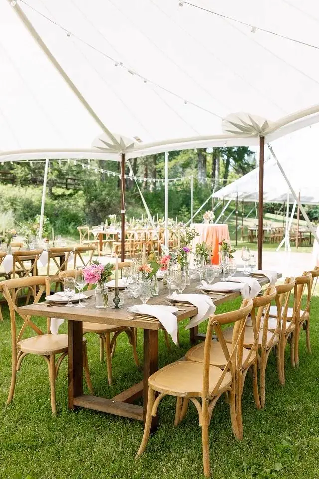
One of the easiest ways to create a more sophisticated wedding design is to stop treating contrast as a problem.
Contrast gives individual elements definition. Without it, furniture, linens, florals, and tabletop pieces can blend together so closely that none of them has enough presence.
Pair Light With Dark
A lighter table surface may benefit from a darker chair or more saturated linen accent, while a deeper wood table may feel balanced beside softer textiles.
The purpose of contrast is not drama for its own sake. It simply helps each element remain visually distinct.
Balance Soft Materials With Harder Finishes
Fabric, glass, metal, wood, and ceramic each reflect light and texture differently.
Combining them thoughtfully prevents the table from feeling one-dimensional. Soft linens can balance polished flatware, while clear glass can lighten the visual weight of a heavier table or darker seating.
Allow One Element to Lead
Not every part of the design needs equal emphasis.
At one wedding, the linen may be the strongest visual statement. At another, the chairs or florals may lead. A third may rely primarily on the venue and use very quiet rentals.
Once the leading element is identified, the rest of the design can support it instead of competing with it.
Coordinate the Ceremony and Reception Without Making Them Identical
The ceremony and reception belong to the same wedding, but they serve different purposes and do not need identical styling.
In fact, allowing the design to evolve throughout the day can make the overall experience feel more considered.
Repeat a Few Details Across Both Spaces
Continuity can come from subtle repetition.
A chair finish, floral tone, textile, or accent color can appear in both the ceremony and reception without requiring every element to be duplicated.
This gives guests a sense of visual connection while allowing each space to have its own character.
Let the Reception Become More Layered
Ceremony design often benefits from restraint because attention is focused on the setting and the couple.
The reception can introduce more complexity through linens, tabletop, glassware, lounge furniture, lighting, and additional textures.
This gradual layering creates a natural visual progression through the day.
Avoid Copying the Exact Palette Everywhere
Using the same exact combination of colors at every point can make the design feel repetitive.
A more nuanced approach might keep the same neutral foundation while changing which accent color is most prominent, or carry one material from ceremony to reception while allowing other details to shift.
The wedding still feels cohesive without feeling static.
Coordinate Lounge Areas Without Turning Them Into a Separate Theme
Lounge furniture can easily feel disconnected from the rest of the reception if it is treated as a self-contained design moment.
Lounge areas do not need to match the ceremony or reception exactly. A stronger approach is to carry through just enough detail for the lounge to feel connected to the larger event.
Pull Through One or Two Existing Elements
A lounge grouping might repeat:
- A neutral already used in the dining area
- A similar wood tone
- One accent color
- A metal finish
- A textile texture
That is usually enough to create a relationship with the rest of the room.
Do Not Require Exact Upholstery Matches
Different seating pieces can work together without sharing identical upholstery.
In many cases, variation makes a lounge feel more natural and residential rather than overly staged. The key is making sure the individual pieces still share enough visual language to belong together.
Keep Lounge Furniture Connected to the Surrounding Space
The lounge area should also make sense beside nearby bars, tables, or dance areas.
A completely separate design concept can make the reception feel fragmented. The best lounge groupings feel like an extension of the wedding rather than a styled vignette dropped into the space.
How to Use a Color Palette Without Overdesigning the Wedding
A palette is a guide, not a requirement that every rental visibly reference the same set of colors.
The strongest designs usually include moments of restraint.
Avoid Using Every Color Everywhere
If the palette includes several tones, each one does not need to appear in every place setting, floral arrangement, lounge grouping, and piece of furniture.
One color may dominate the linens while another appears only in flowers or glassware. A third may show up in small accents rather than large surfaces.
This gives the palette room to breathe.
Use Neutrals to Give Accent Colors Space
Neutral rentals can be particularly valuable when florals or textiles carry stronger color.
A quieter chair or table allows an accent linen to stand out more clearly. Neutral dishware can give colorful flowers or glassware more definition.
Restraint often makes color feel more intentional.
Allow the Setting to Provide Additional Color
The wedding does not exist only within the selected palette.
Landscape, venue architecture, flowers, natural light, greenery, and surrounding materials all add color. Trying to control every tone can make the design unnecessarily rigid.
A flexible palette leaves enough room for the environment to remain part of the visual experience.
A Simple Coordination Guide for Major Rental Categories
| Rental Element | Coordinate It With | Avoid |
|---|---|---|
| Tables | Venue materials, chairs, linen direction | Choosing solely from a catalog image |
| Chairs | Tables, ceremony setting, formality | Treating chair finish as visually insignificant |
| Linens | Furniture, florals, venue, overall palette | Repeating one exact color everywhere |
| Dishware | Linen, menu style, overall formality | Adding complexity without purpose |
| Glassware | Palette, florals, surrounding tabletop | Assuming it must match the linen |
| Flatware | Other metallic details | Mixing finishes unintentionally |
| Lounge furniture | Reception furniture and accent tones | Creating a separate design concept |
The table is best used as a final design check rather than a set of rigid rules. Every category should relate to the wedding as a whole, but the relationships do not need to be identical from one event to another.
Mistakes That Make Wedding Rentals Feel Mismatched
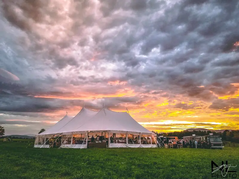
A wedding can use individually beautiful pieces and still feel visually disconnected if those selections are made without enough context.
Most coordination problems come from a few recurring design habits.
Matching Colors Too Literally
Trying to find one exact shade across different materials can make small variations more obvious.
Fabric, paint, wood, glass, and metal reflect light differently, so identical color matching is rarely realistic. Coordinating tones usually produces a more natural result.
Choosing Each Rental in Isolation
A chair might look appealing on its own but feel too heavy beside the table. A linen may work beautifully in a showroom but conflict with the venue's existing materials.
Individual pieces should be evaluated as part of a larger composition.
Ignoring Texture
A palette can technically coordinate while still feeling flat if every surface has a similar finish.
Texture gives the design dimension. Smooth glass beside woven fabric, polished metal beside wood, or soft upholstery near structured furniture can all create more visual interest without requiring additional color.
Introducing Too Many Statement Pieces
A statement chair, bold linen, colored glassware, dramatic florals, distinctive bar, and heavily styled lounge area can all be beautiful individually. Used together, they may compete for attention.
A stronger design creates hierarchy by allowing a few elements to lead while others remain quieter.
Designing Only From Digital Images
Colors and finishes can appear differently depending on the screen, photography, and lighting.
Digital references are useful for narrowing options, but couples should remember that materials will ultimately be seen within the venue and under the lighting conditions of the actual wedding.
What Should Couples Finalize First?
Design coordination becomes easier when couples work from the largest visual decisions toward the smaller ones.
Begin with the venue and overall aesthetic direction. Once the setting and general mood are clear, major furniture can establish the foundation of the room. Linens can then introduce the dominant textile and color layer, while tabletop pieces and smaller accents refine the design.
This order allows each choice to respond to something that has already been established instead of requiring the entire wedding to be designed at once.
It also leaves room for later details to evolve as florals, guest count, and the final reception layout become clearer.
A Cohesive Wedding Does Not Require Everything to Match
The goal of wedding design is not perfect color repetition. It is creating relationships between the elements guests see throughout the day.
Tables, chairs, linens, dishware, glassware, flatware, florals, and lounge pieces should feel as though they belong to the same celebration, but they do not need to use identical colors or finishes. Cohesion can come from repeated materials, balanced contrast, shared undertones, or simply a consistent level of formality.
For Flathead Valley weddings, the venue and landscape should also be allowed to remain part of that design. Rental choices can complement the setting without trying to control or imitate every color already present.
Celebrate Event Rentals offers furniture, linens, dishware, glassware, and flatware that can be considered together when building the visual direction of a wedding. The strongest result comes from selecting those pieces as parts of one composition rather than trying to make each item match the next exactly.
Frequently Asked Questions
Do all wedding rentals need to match the same color palette?
No. Rentals should feel coordinated, but they do not need to repeat the same colors exactly. Neutrals, natural materials, texture, and carefully chosen contrasts can create a more layered design than strict color matching.
Should linens match the bridesmaid dresses or flowers?
Not necessarily. Linens can complement the broader wedding palette without reproducing the exact shade of a dress or flower. Choosing a related neutral, softer tone, or contrasting color can often create more depth.
Should ceremony chairs and reception chairs match?
They can, but matching is not required. The two spaces can still feel connected through material, finish, overall formality, or another repeated design element.
How many wedding colors should couples use?
There is no single ideal number. A more useful approach is to choose a small group of anchor colors, support them with neutrals, and allow the venue, flowers, and natural surroundings to contribute additional tones.
When should couples finalize linens and tabletop rentals?
Linens and tabletop are easier to finalize once the venue, major furniture, and overall design direction are established. At that point, couples can evaluate individual pieces within the context of the complete reception rather than selecting them in isolation.